hmph
Moderators: Sora, Balmung, Bear, Kite
-
greensteeldragon

- Player Character
- Posts: 144
- Joined: Tue Jul 01, 2003 12:20 am

-
End of a Shadow

- Player Character
- Posts: 383
- Joined: Sun Apr 27, 2003 12:17 am
Word of advice, use a lighter backdrop for the site, makes it harder for people to see the text. Also that icon for the mouse is slow for my cable, I can't even think how much slower its for dial up pplz.
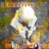
Image itself, good freehand drawing but its better and more statisfying to the artist when the make their own original works. Like study a few pics of kite for awhile and then make your own pose for him or in some cases like D, make a webcomic
Image itself, good freehand drawing but its better and more statisfying to the artist when the make their own original works. Like study a few pics of kite for awhile and then make your own pose for him or in some cases like D, make a webcomic
.hack//Integral -- A .hack up-to-date information, discussion,
text-based roleplaying, gallery, store, giveaways, and more site!
text-based roleplaying, gallery, store, giveaways, and more site!


*enters web design major mode*
First off, make sure when you use the backdrop, that it is lighter than the text on the page itself. By all means, if it is necessary, kill the opacity of the image in a text editor to lighten it if you're detirmined on continuing using it. The problem with it is that it makes it incredibly difficult to ready any text and see/find any links on the site. I couldn't even locate the Kite image immediately.
Second, just letting you know that mouse pointer things like that on your site are very generally looked down upon. In short, it's tacky, and resource heavy. It makes the page slower to load. You want the page to be able to load quickly, because if a person can't get what they want in first glance, then they're not staying there long.
Just a little advice to make it a better looking site to host your art.
Budget Zen: When you see something so stupid that your mind goes blank rather than try to rationalize it.

